


Colors, Filters, and Feelings: 5 Films that Speak Through Visuals
Movies, TV shows, and screen adaptations that use color to enhance their story

I recently watched Emma (2020) for our Emma by Jane Austen: Adaptations episode for The Novel Tea podcast. This movie is so aesthetically pleasing with how it uses color, backdrops, patterns, and costumes to send messages to the audience without distracting them from the overall plot; it got me thinking about other examples of films that use this to enhance their story. Whether it’s a sun-soaked romance or a war film with no warmth, the colors and visuals are intentional and provide meaning.
In this newsletter, I wanted to talk about some of these examples and how they are effective in the storytelling process — and, we’ve got a bonus Austen episode out today with a special guest, so stay tuned for details!
Emma (2020)
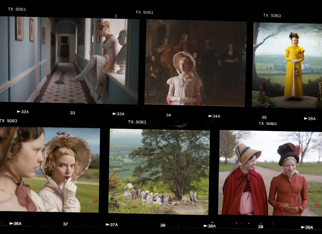
Autumn de Wilde’s take on Emma was a candy colored perfection where every color speaks on influence, appearance, and control. In the movie poster, the iconic yellow overcoat Emma is wearing seems to bleed onto other characters as she interacts with them. You see other characters adopt this yellow throughout the movie to show when they are being influenced or affected by Emma.
The pastels and colors in this movie are well-known and recognized, and it is interesting to analyze how the pale pinks and buttery yellows start to become warmer as Emma becomes more grounded in her personality. When the characters enter the outside world, the setting takes on a powerful amount of greenery to contrast with the yellow claustrophobia of control that we see with Emma. The florals and greens give the audience a breath of fresh air with their openness and natural ambiance. But the soft yellows and fresh greens aren’t just pretty — they show us the difference between the world Emma’s trying to control and the one where she actually starts to grow.
Dunkirk (2017)
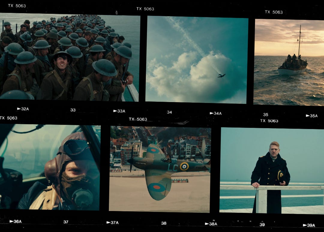
Christopher Nolan came into this movie with coldness, fear, and emotional distance in mind. No speeches, no hero shots, just plain old tension. The wide shots of the sea and sky are overwhelming and make you feel small and trapped. The beach seems to stretch forever and ever, and the ocean ever further than that, and although beaches and sky usually symbolize cheer and freedom, in Dunkirk, the endless space comes off uncomfortable and fearful.
The prominent colors are blues, greys with a muted atmosphere. The lack of warmth matches the tone of the movie and gives an overall mechanical brutality that makes the audience feel the fire and destruction when the red and orange contrasts with the steely landscape.
Call Me By Your Name (2017)

Call Me By Your Name is set in the 1980s Italian countryside, and the entire movie looks like a sun-kissed vintage postcard. The colors are warm and cozy, golden and full, soft greens and pale blues, and the occasional burst of peaches (iykyk). The movie was shot with mostly natural light, giving a dreamy, haze-like effect that builds and fades to parallel the romance in the story.
What I love most about the colors in this movie is that their effect makes it feel very lived-in and almost nostalgic to the viewer. The perfect blue of the swimming pool, the yellow shine of a bike sitting under the sun, and the pale green vines wrapping around the windows and buildings make you feel like you know the space and have been here before, which give you more emotion into the longing, love, and despair of the main character.
Euphoria (2019-)

Euphoria is a full-blown visual overload… which is accurate to the experiences of these high school students. The colors are not just aesthetic; similar to Emma, the colors are attributed to characters as well. Rue’s purples and dark ambiance represent her inner chaos, and Jules’ pastel pinks and sparkles represent her softness. Scenes change suddenly and drastically to scrub through the different emotions of different characters to show the rage, moodiness, and contrast between these teenagers.
When the scenes with drug usage come into play, the visuals become even more distorted and disconnected from reality. The lighting gets looser, the camera floats, and the colors melt into each other like it’s trying to show us what it feels like to lose touch with everyone around us.
Mad Max: Fury Road (2015)

All Mad Max movies have a similar sandy undertone, but Fury Road played with the orange to blue contrast in such a memorable way. George Miller wanted the movie to look extreme, hard, and harsh to represent the journey and landscape. The desert isn’t just beige sand; the intense saturated orange makes it seem like it is burning and almost makes the viewer feel the heat of the terrain. Pairing that with the cyan skies and the industrial interiors of their quarters gives an eerie sense of conflict and survival.
The orange and the blue also match the mood of how the story ebbs and flows. The chaos, action, and edgy scenes happen under the blazing orange sun, and the more hopeful internal moments happen at night under the desert blue sky.
In these films, color and filters aren’t just for show; they’re part of the emotional blueprint and guide how we feel without the need for any dialogue. From pastel-perfect matchmakers to fire-lit road warriors and neon-soaked teens, each story becomes more powerful when it looks the way it feels. We’d love to hear about some other movies or shows that similarly caught your eye. Leave a comment below!
—Neha
Up Next
Today we’re sharing a bonus episode: ‘Jane Austen Adaptations’ with special guest Izzy from What the Austen? We talk all things adaptations, including what makes a great one, the best screen adaptations, and the worst! Tune in now wherever you get your podcasts to join the fun.

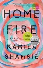
And next week, we will be discussing Home Fire by Kamila Shamsie, a retelling of Antigone set in the present day that explores questions of family, loyalty, and legacy. We talk about some parts we really loved in the novel, and some of our major issues with its construction, and we also share some background on Antigone to help ground the discussion!


These are great! I’d add two recent films I watched: Widow Clicquot and Conclave. Insanely beautiful pictures and colors.
Really enjoyed your Emma adaptations podcast! I am a huge fan of the Gwyneth Paltrow version mainly cos I watched it growing up and it's so cosy and kind. Got totally obsessed with the 2020 version and watched it about 4 times in a year - cool to hear you guys dissecting the visuals I think that's a big part of what's so compelling about it, it's just delicious!